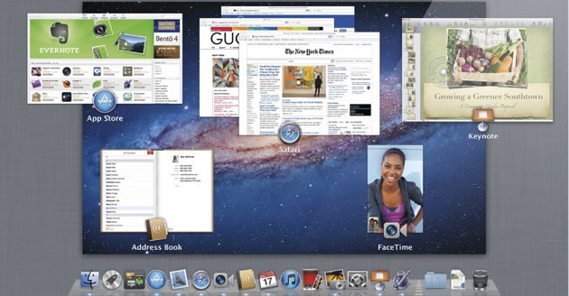
The newest version of Apple's Mac OS X operating system is finally here, and Lion has brought with it both minor tweaks and some big changes, but is it all for the better? Apple's iPhone and iPad lines have been selling at a rate that puts hotcakes to shame, and while the Mac computer line has a thriving fanbase of its own, there's no question that the company hopes to turn iOS users into Mac users as quickly as possible.
To this end, Lion appears built from the ground up to make iPad users — who have perhaps never considered owning a Mac — feel as comfortable as possible with the foreign operating system. These changes make Lion feel more accessible to would-be Mac converts, but also throw a bit of a curve in the road for existing customers who have been using Apple computers since before the iOS craze.
The touchable trackpad
The most immediate change that Mac fans will notice is that scrolling has been reversed. That's right, moving two fingers up on the trackpad or Magic Mouse no longer causes a web page or document to scroll up, instead it scrolls down. This might seem like a completely nonsensical change — and if you're not an iPhone or iPad owner, it is — but it's just one of several changes that make Lion feel more like an iPad experience.
On the iPad, as well as the iPhone, you use the touch screen to navigate things like web pages. Placing a finger on the screen and pushing up moves the page itself upwards, effectively scrolling down. Now, when you touch your Mac trackpad or Magic Mouse and push up, the page scrolls down as well. It's a simple change that could go a long way to making iPad owners feel at home, but it might also make Mac diehards feel like the new OS is catered to someone else. Thankfully, the new "feature" can be disabled by visiting the options menu.
Launchpad is ready for takeoff
Launchpad is a new way to view all the applications installed on your Mac, and it's unapologetically iPad-esque. Clicking the new Launchpad button on the icon dock causes all other applications to fade from sight, leaving you with an out-of-focus view of your desktop with all of your computer's apps presented in a grid-like fashion.
From here you can launch whatever program you desire, and also organize your apps into folders just like on an iOS device. If you happen to have more apps than can fit on a single Launchpad screen, multiple screens will be created which can then be scrolled through. If you don't feel like using Launchpad, there's no reason you need to, as the original Finder menus can be used to locate applications just like always, but new users might benefit from the familiar look.
Bye-bye scrollbar
Another noticeable change is that a the typically static scrollbar is decidedly absent. Instead, a dynamic scroll bar takes it's place, and only appears on the screen when you're actively scrolling, disappearing quickly after you choose a new position on the page. Again, this is an option that can be disabled, but it is clearly aimed to make Apple's computer line feel just a tiny bit more like its portable devices — and vice versa.
Apps go fullscreen
Lion introduces the ability to make your applications dominate the screen. Up until now, apps like web browsers could only take up part of a Mac display, with the dock (if unhidden) and top menu bar remaining visible at all times. This limited screen real estate and could sometimes give a cramped feel.
Lion fixes this by allowing programs like the Safari browser and Mail app to go fullscreen by clicking a pair of arrows in the upper right-hand corner. This makes each app the star of its own show, and you can switch between your various fullscreen apps by swiping three fingers to the left or right on your trackpad. This feature is useful in its own right, but it should also provide iOS veterans the simple all-or-nothing feel they've come to expect when using apps on Apple's mobile devices.
These changes are already being met with mixed reactions from early adopters around the web. As could be expected, some feel that Apple is catering to the new breed of Apple user who have been introduced to the brand through its top-selling mobile devices. Others see it as the next step for an operating system that has always been about the user experience. If you've given Lion a try, be sure to let us know how you feel about the new features in the comments section.
Source: by Mike Wehner from Tecca


Recommended Comments
There are no comments to display.
Join the conversation
You can post now and register later. If you have an account, sign in now to post with your account.