-
Posts
3082 -
Joined
-
Last visited
-
Days Won
94
Content Type
Forums
Profiles
Events
Gallery
Downloads
Articles
Everything posted by TheSilencerPL
-
Which IDE (Integrated Development Environment) do you prefer? Here are some descriptions of some I've had experience with. Number 1 of all for me: SlickEdit It's the commercial one, but it offers really flexible and comfortable environment. I like it the most mainly because of its editing features, but debugging perspective is also one of my favorites. It's advertised by the authors as the tool created by the programmers for the programmers. And this is true, at least for me. It handles fluently different languages, like java, C, C++. It's really convenient to use it. For example, the feature I like the most is the possibility to work without even touching the mouse. Shortcuts are really easy to remember, and auto hovering windows are top notch. Finding tag occurrences with the preview of its usage in the found place is fantastic. Haven't found better so far. It supports windows and linux. There is also slickedit eclipse plugin available, but I haven't used it. Autocompletion is great. There are some problems sometimes, when it doesn't follow your changes fast enough, but this happens really rarely. To correct that, just retag the project, and you are OK again. It's very small in size and extremely fast and lightweight. Code::Blocks It's my second tool of favor, equally with Eclipse CDT (well eclipse wins a bit, because it supports auto generated doxygen tags in comments, while C::B doesn't). When I write about doxygen tags auto generation I think of auto-completing these tags after writing "/**" and pressing ENTER. The editor creates the function documentation block with parameters for you, so you don't have to type it all. Maybe it can be done by some templates, but I would like to have it right away. Despite some problems I have encountered while using it (Copy and Paste problems in xfce) I like it very much and use it very often. One of the features which I like is importing of VS workspaces, solutions and projects. It's very convenient when you work on some VS project, but you don't like VisualStudio. Code completion works fine. Flyovers of function and its parameters after placing mouse cursor over the function is very convenient. Eclipse CDT The same as C::B or even better now. I had some experience with it some time ago, when the CDT was in it's early stages. I dropped it right away, it was not a great tool then with so many errors, problems and missing features. It was really hard to work with. The project matured and I gave it another chance lately. It's really a good tool to recommend. First of all, for all java developers, they don't have to learn new IDE when they need to switch to C or C++. Code completion works right from the start. In the old days ctags had to be configured in order to have code completion. I take it as a great improvement. Doxygen documentation tags are supported. Even in the old days the debugger was quite good and it's even better now. It has very nice memory viewer. The debugged supports gdb only if I am correct. Code annotations in editor with warnings/errors that might/will occur during compilation is the very nice feature. You see right away that there is something wrong with the code. Eclipse has also great SVN client available as a plugin: Subversive. CodeLite I haven't played with it too much, but I will surely get back to it and give it another try. I removed it after I started to lack things from C::B, but maybe it was too quick decision It has more modern GUI than C::B so at first look it looks very nice. I don't remember now which features of C::B I was missing, so please forgive me not mentioning them here. But maybe I just didn't turn them on, because I didn't know how to do it CodeLite is the IDE that should run low on resources, and I think that in comparison to C::B (again ) it is better. The same thing like in C:B, no support for doxygen autogenerated coments. Please share your opinions here. Unfortunately I don't have time to write more, maybe I will have time for it and I will update this post in the future There are still some IDEs to be described, like: kdevelop, netbeans,
-
Yep, we've almost added some things that would prolongate the tests and delay the release. But finally we decided to release without it and 0.3.0 is really coming soon. We are tired of waiting too
-
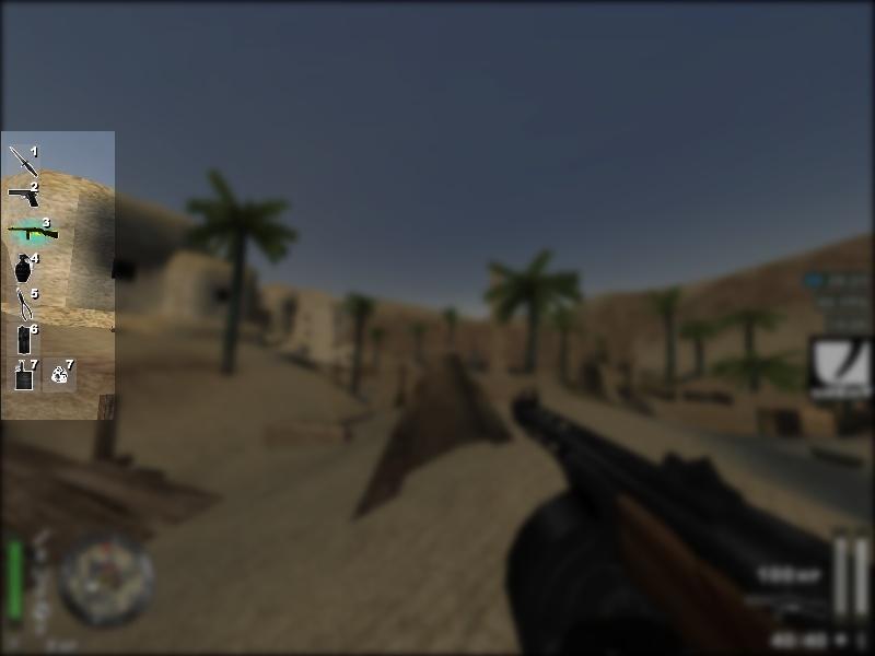
Weapon banks display. Notice slot 3. The difference between wide slots and equal slots is depicted. For wide weapon icons the wide slots are used when the cg_wbWideSlots cvar is set to 1. It can be changed in the config menu: silEnT->HUD under Weapon Banks Display category. Wide slots: Equal slots:
-
New Techland production. Work on Dead Island is going on since 2006. From that time however the game changed a lot. There are zombies in it but... When Techland showed the Dead Island for the first time, in 2006, it seemed that it would be the thoughtless shooter with zombies as the only attraction. After last presentations and informations it is now clear that it is something completely different. The game is not thoughtless and it's not even a shooter. Dead Island after the transformation is a zombie slasher from the FPS perspective and with RPG elements. Sounds complicated? Let me explain - zombie, because there are zombies. Slasher, because zombies are killed mainly with the fire weapons. FPS perspective, because.. well you know. And RPG elements, because the main characters can be developed, and moreover, the crafting appears. Now it does not sound complicated, does it? It sounds interesting, doesn't it? In Dead Island there will be four characters. All, at the beginning complete strangers to each other, meet on the fiction island Banoi, located near Papua New Guinea. Soon the circumstances will unite them - inhabitants of that beautiful seaside resort will loose theirs lives to get it back later as zombies, and those who survived will have to fight for their lives. Mentioned Banoi island can be visited rather freely, rather like in RPG game and not like in a shooter. The plot is going to be intriguing but that what is going to happen between one and another culmination moment depends mainly on the player actions. The tasks which are going to be completed will be in most cases marginal and optional - player could do them and gain the experience points and new equipment but at the same time he/she could ignore them and focus on the main plot. There will be over 200 tasks in total. There will be four characters to choose from. In addition to the single player mode there will be also the cooperation mode for even four characters. Dead Island is to be released this year, but closer to the end of it rather than the middle of it. For now we are left to enjoy the trailer (below) and wait for further informations. Here is the trailer: http://www.youtube.com/watch?v=lZqrG1bdGtg This post has been promoted to an article
-
-
-

Implemented Fireteam enhancement
TheSilencerPL replied to TheSilencerPL's topic in Added / Completed Features
We made it like this (at least for now). We added the alignment fix, so when the FT display gets out of the screen it is aligned to the right screen edge. We also added the config item for the cg_locations cvar to the hud config menu, so it is more apparent for the users. Just to remind: cg_locations cvar is responsible for the locations display type; locations can be displayed as: only XY coordinates, only location name, both (XY coordinates and location). -

Implemented Compass slide out
TheSilencerPL replied to TheSilencerPL's topic in Added / Completed Features
Done (since 0.3.0) -
After we finish the tests Soon. Probably this week or so. We decided to add something extra that was not planned at the beginning of this release (due to longer than planned "production" period of some other thing) That's the main reason of the longer test period.
-
It's enough. I tested both of them, and the changes are noticeable so that etpro is easily distinguished from etpro2. That's why I added it as the second etpro HUD.
-

Implemented Fireteam enhancement
TheSilencerPL replied to TheSilencerPL's topic in Added / Completed Features
Well it's displayed depending on cg_locations cvar. If some players don't like it they can set cg_locations to 0. I would leave this feature. Some may like it some may not, but definitely it is sometimes handy to know where somebody is without checking the coordinates on the map. I say we just change the alignment. -
It has been added as etpro2 HUD. SO now there are 2 etpro HUDs too choose from.
-

Implemented Fireteam enhancement
TheSilencerPL replied to TheSilencerPL's topic in Added / Completed Features
We can make it stay aligned to the right so it doesn't go out of the screen. Then it wouldn't matter if it displays coordinates only or location names. -
On behalf of Dragon Make the compass slide out to the bottom of the screen when it is placed on the bottom of the screen. Like in Jaymod when the alternate HUD is used.
-
On behalf of Dragon Make Fireteam always show only coordinates of the players and make it preserve the same width. Examples below: 1. FireTeam on maps where the player's location is displayed as coordinates: All OK, FireTeam fits the screen. 2. FireTeam on Gold Rush where instead of coordinates names of the locations are shown: FireTeam display gets out of the screen. It concerns new etpro HUD where the FT is on the right and it often gets out of the screen to the right.
-
On behalf of Dragon Could you do the fix for the weapon animation during fast reload (like in NQ for example) so that the animation of reloading Thompson, for instance, doesn't finish in the middle?
-

Implemented New pre-defined HUDs
TheSilencerPL replied to Dragonji's topic in Added / Completed Features
Thanks Dragon. New HUD created by you will be in the next release -
OK, great Thanks. We will place it among predefined HUDs then.
-

Implemented New pre-defined HUDs
TheSilencerPL replied to Dragonji's topic in Added / Completed Features
PMed you -
Please post your saved HUDs along with the HUD screenshots.
-

Implemented New pre-defined HUDs
TheSilencerPL replied to Dragonji's topic in Added / Completed Features
Predefined HUDs (other styles of HUDs) got out of scope for the 0.2.1 successor (0.2.2 or other). We have plans to do this in the 1st release after it. However I can see that ETPro HUD is rather placing standard HUD objects in different places. If you are willing to help, you could edit HUD in your client to look like ETPro one, then save it and post it here in some thread. Then people could download it and use it on their own clients. Please write if you need some assistance. I have created a thread for it: http://mygamingtalk....topic/430-huds/ OR you can create one described above and we can include it in the next release as one of predefined HUDs. But you have to hurry we release soon, probably next week or so -
Welcome aimbot! Only one thing, don't use your aimbot on us


